新浏览器的实现
指的是firefox、chrome和IE9。新浏览器都支持CSS3新添的transform属性,所以实现倒影效果非常简单。从下面的代码看到,各家浏览器对transform的实现有点不同
-webkit-transform: scaleY(-1); /* webkit内核浏览器的实现,例如safari */
-moz-transform: scaleY(-1); /* firefox 的实现 */
-ms-transform: scaleY(-1); /* IE 的实现 */
-o-transform: scaleY(-1); /* Opera的实现 */
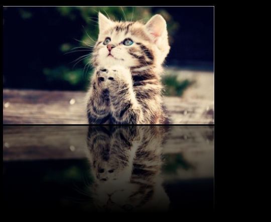
<div class="wrap"> <div class="image"><img src="1.jpg" /></div> <div class="down"> <div class="reflection"></div> <div class="overlay"></div> </div> </div>
body{background:#000;color:#f00} .wrap{position:relative;} .image{margin-bottom:3px;} .down{position: relative;} .reflection{width:421px;height:180px;background:url(1.jpg) bottom center no-repeat; -webkit-transform: scaleY(-1); -moz-transform: scaleY(-1); -ms-transform: scaleY(-1); -o-transform: scaleY(-1); transform: scaleY(-1); opacity:0.5; filter:alpha(opacity='50'); } .overlay{position: relative;width:421px;height:180px;bottom:149px; background-image: -moz-linear-gradient(center bottom, rgb(0,0,0) 20%, rgba(0,0,0,0) 90%); background-image: -o-linear-gradient(rgba(0,0,0,0) 10%, rgb(0,0,0) 30%); background-image: -webkit-gradient(linear, left bottom, left top, color-stop(0.20, rgb(0,0,0)), color-stop(0.90, rgba(0,0,0,0))); filter: progid:DXImageTransform.Microsoft.Gradient(gradientType=0,startColor=0, EndColorStr=#000000); } 在倒转的图片上面还加了一个DIV.overlay层,做出渐变的效果,使倒影看起来更真实。
兼容旧浏览器的实现
考虑到还有相当多的人在使用旧版浏览器,程序员绞尽脑汁为这部分人做兼容。这里指的是IE7/IE8。IE6怎么办?提示用户升级浏览器吧。
旧IE不支持transform属性,可以使用滤镜 filter:flipv 来生成图片倒转,但会跟IE9的transform冲突。所以要用到各种 hack 来解决。修改后的CSS如下,添加了IE9 hack,覆盖掉上面的filter:flipv的属性。
body{background:#000;color:#f00} .wrap{position:relative;} .image{margin-bottom:3px;} .down{position: relative;} .reflection{width:421px;height:180px;background:url(1.jpg) bottom center no-repeat; -webkit-transform: scaleY(-1); -moz-transform: scaleY(-1); -ms-transform: scaleY(-1); -o-transform: scaleY(-1); transform: scaleY(-1); opacity:0.5; filter:flipv alpha(opacity='50'); /*ALL IE*/ } @media all and (min-width:0) { .reflection{filter:alpha(opacity='50') \0/;} /*IE9*/ } .overlay{position: relative;width:421px;height:180px;bottom:149px; background-image: -moz-linear-gradient(center bottom, rgb(0,0,0) 20%, rgba(0,0,0,0) 90%); background-image: -o-linear-gradient(rgba(0,0,0,0) 10%, rgb(0,0,0) 30%); background-image: -webkit-gradient(linear, left bottom, left top, color-stop(0.20, rgb(0,0,0)), color-stop(0.90, rgba(0,0,0,0))); filter: progid:DXImageTransform.Microsoft.Gradient(gradientType=0,startColor=0, EndColorStr=#000000); }